The sad state of e-book formats based on my attempted conversion of Magic Ink
January 05, 2012
At some point in the last summer, I decided that I want to learn more about the e-book technical format. Mostly that meant EPUB, though I understand that others like MOBI that Kindle uses are quite similar to it.
I knew that the essence of the format is that it is a zipped HTML with the assets and metadata, but I wanted to go through the publishing experience myself and learn all the details. How different is the format from regular HTML? What is the state of the publishing tools? How do different reading softwares and devices render the content?
I didn’t find a reference/tutorial for ePub that I liked. My workflow consisted of reading the Wikipedia article, dissecting miscellaneous ePub files that I found in the wild, making experiments, and passing my experiments through the quite decent epubcheck package. The experiments consisted of both handcrafted HTML and authoring it through various publishing packages like Pages of iWork.
The publishing softwares did a semidecent job, but lacked in many aspects. For example, they produced a strangely leaded (linespaced) layout with/without paragraph indents, or had too little control over how a multilevel table of contents works. In the end, I decided that the best route for me is to simply handcode and manually zip the HTML, as it lets me most viscerally experience the format.
I chose Bret Victor’s Magic Ink as my trial project. This was for two reasons. First, it is an amazing piece of material and everyone claiming to be a designer should read it. Second, it kept crashing my iPad as I read it last year before iOS 5 came out. I think it was about the HTML version crashing Safari (I don’t think this is any more the case in iOS 5), and the PDF version being strangely laid out. I wanted to have a good reading experience on my iPad.
So I got busy and produced an ePub version of Magic Ink. As a side benefit, having to go through the material multiple times, over and over as I read and tweaked the proofs, means that I basically memorized it all.
You’ll notice that the web and PDF versions (PDF is just a rendering of the web page) copiously use sidebars and references. This is where the biggest trouble was. No doubt Bret was inspired by page layouts of Edward Tufte’s information design books. (And Magic Ink convinced me to read all of those last summer too.) If you haven’t held any of those in your hands, you should give it a shot. They’re beautiful. The page layouts are carefully composed and crafted, and sidebars are integral to the material.
With EPUB, it is impossible to reproduce the sidebars and layouts to any sort of fidelity. The goal of this format is to be reflowable on many devices, and thus there is no concept of a page layout or columns. It is basically an endless single column. It can reproduce images, yes, but material like Magic Ink would have to be seriously reworked to be publishable in this format. The sidebar references and images have to be done as either endnotes or inline material.
I did do all of this work, and converted all the Magic Ink material to EPUB with mixed inline and endnote references. But we ended up not publishing it.
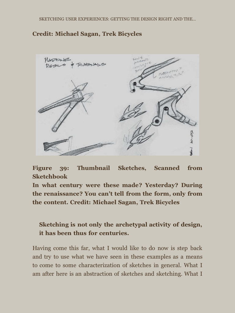
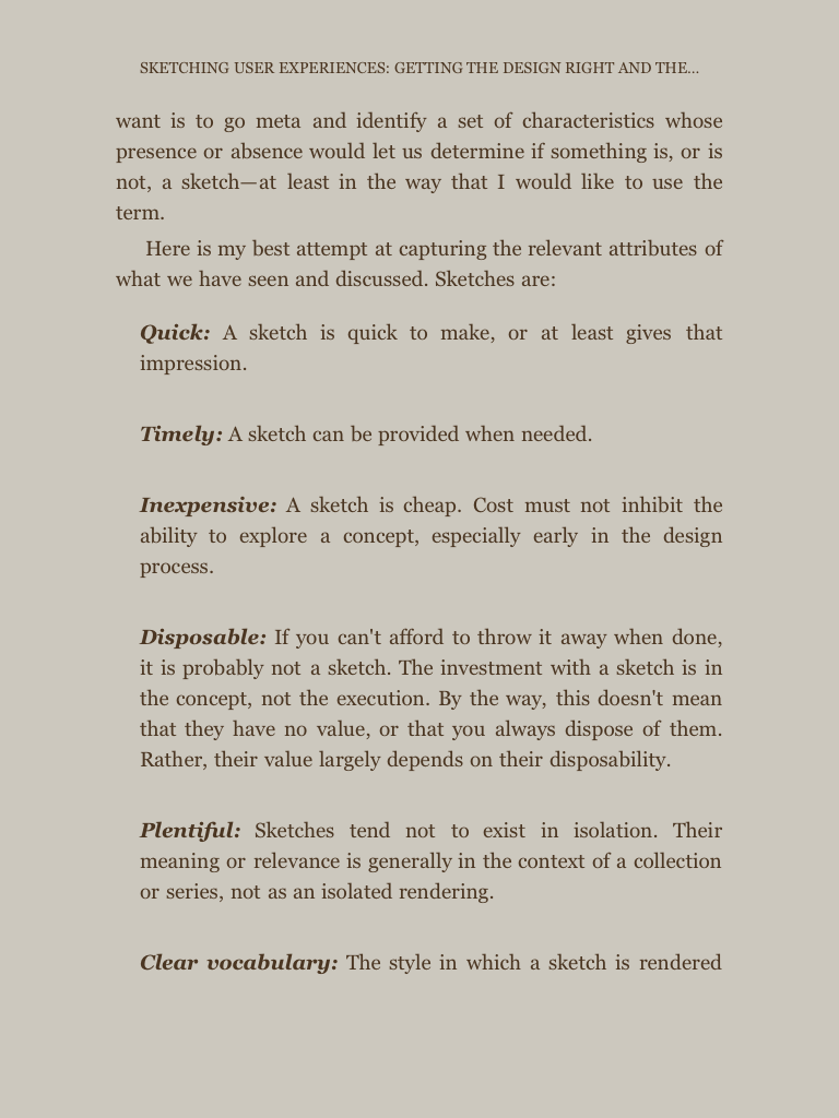
Here’s an illustration about my disillusion with the format. It’s about Kindle instead of EPUB, but this technicality doesn’t matter. Here’s a spread from Bill Buxton’s “Sketching User Experiences” as a paper book.
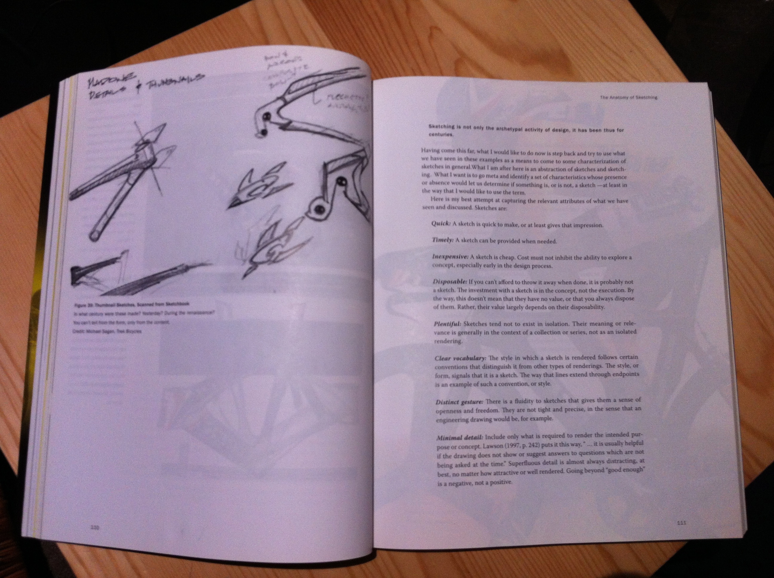
See the full bleed of the picture? See how the material on the spread works together? How there’s nice whitespace all around? How the ink from the previous and next pages kind of blends in the current page? How it actually has character which is reinforced by typography?
Here’s part of the same spread in Kindle format.
You can kind of get the same information, but it’s blah and generic, with randomly reflowed content and generic type. And some of the finer text on the image is plain unreadable due to the much lower resolution of image reproduction.
I have the EPUB file of Magic Ink, but Bret asked me not to publish it until he gets to reworking the material to better suit the format, and I think it is never going to happen as he surely has much better things to do. And it’s wrong that he should do it at all. The format should suit the needs of the author instead of the author wasting time to fit in the super limited constraints of the format. Constraints are sometimes justified, but ebooks are clearly the wrong tool for producing books with nice designs.
In my final email to Bret about the project, I said:
I’ve been reading Tufte and Stephen Few lately, and drowning myself in the beautiful page layouts, which all somehow inspired your work. And while at it, I’ve been thinking about the sad state of the reflowable e-book format that I was playing around with. I’m not really convinced that this terrible format would do justice to the Magic Ink material. To me, part of the goal of the project was to understand the format and its limitations and how to do the conversions, and all that I can see is that it’s suitable for text-based fiction, and not much more. … If you do want to republish it and revisit the material, then, unless you have a specific publishing goal, ePub and other similar formats probably bastardize the material more than they do good to anyone.
He posted a tweet which appropriately captures the sentiment and expands it based on his own recent work:
Dear e-book platforms: If you don’t support computation & dynamically-generated gfx, you are not an e-book. You are a fax machine simulator.
If I wanted to publish a nice e-book these days that required more than simple reflowable text, I would do it one of these two ways:
Just a PDF. (How long until we get authors selling their books as PDFs the same way that Louis CK made a million bucks with his video?)
Or make an app, perhaps the same way that Al Gore’s “Our Choice” was published, and won the Apple Design Award for 2011. The Push Pop Press guys who made the software were bought by Facebook, but clearly there’s room for more games in town. This is also the route that magazine publishers are taking. All of iPad magazines are produced and published with some sort of middleware or app framework that gives the publisher decent control over the layout and embedded/linked media.