The case of excessively padded blog posts
August 08, 2011
There’s this thing on the Internet recently that I find annoying. When a company has some news to announce, they can’t for whatever reason just announce the news. They feel that they have to pad it with cutesy text to make it more palatable and look like a more complete article. Yet, all they accomplish is just confuse both themselves and the readers.
Case in point: a recent funding post by Twitter. Now, I have nothing against Twitter specifically, they are just a high profile site and provided a recent salient example. You can find similar posts in the blog of Google and other companies.
Well, okay then. Here is the post.
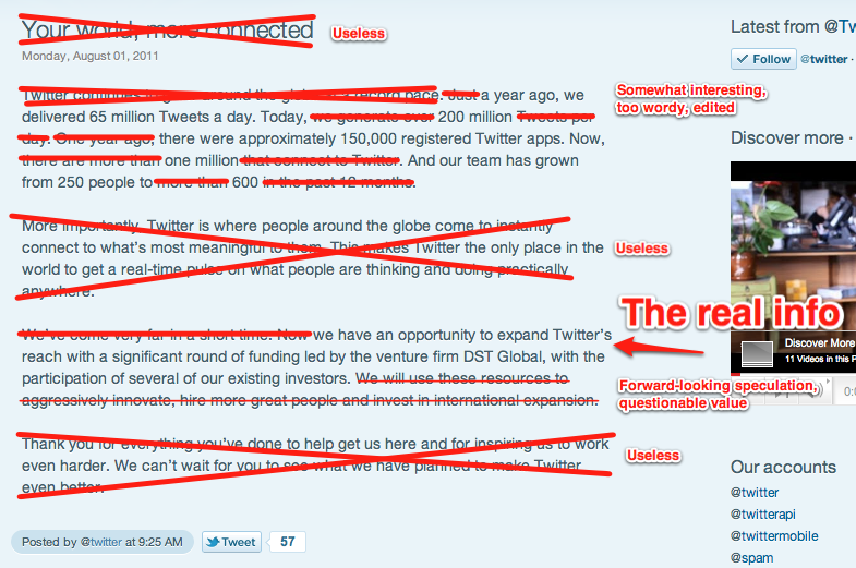
Twitter continues to grow around the globe at a record pace. Just a year ago, we delivered 65 million Tweets a day. Today, we generate over 200 million Tweets per day. One year ago, there were approximately 150,000 registered Twitter apps. Now, there are more than one million that connect to Twitter. And our team has grown from 250 people to more than 600 in the past 12 months.
More importantly, Twitter is where people around the globe come to instantly connect to what’s most meaningful to them. This makes Twitter the only place in the world to get a real-time pulse on what people are thinking and doing practically anywhere.
We’ve come very far in a short time. Now we have an opportunity to expand Twitter’s reach with a significant round of funding led by the venture firm DST Global, with the participation of several of our existing investors. We will use these resources to aggressively innovate, hire more great people and invest in international expansion.
Thank you for everything you’ve done to help get us here and for inspiring us to work even harder. We can’t wait for you to see what we have planned to make Twitter even better.
Let me put my red pen to work and do an analysis of this post from the perspective of “information ink.” Tufte analyzes information graphics for “data ink”, that is, “pixels spent on information graphics / all pixels spent on the visual.” I believe that a similar metric can be applied to any text, that is, “characters of material and substantial info / all characters in the text.” So, from that perspective, let’s go over this blog post.
The single piece of news in this post is that Twitter got extra funding from DST Global and some other investors. Yet, it’s excessively padded.
Who are these padded posts for? Investors? Regular users? Media? Pick one and focus. As it stands now, this post doesn’t really help anybody.