Skype 5 for Mac: spatial arrangement and inconsistent single-window design
March 31, 2011
LKM has posted a very interesting piece on Skype 5 for Mac design. This triggered me to jot down a few notes of my own, reflecting on some things that he brings up.
Evolutionary UI and spatial arrangement
He illustrates very well the point that the old design with focused task windows had a nice evolutionary quality to it. Starting out simple, it scaled up naturally as the user evolved, with “one window per task” (call or chat). If you are a basic user, it has just a few windows. If you go crazy like LKM and arrange your chats on a virtual desktop, it continues to work fine.
A simpler case of spatial arrangement that I struggle with, is that in the old version, chats in the drawer were always in the same order. You could remember the people and groups according to the positions in the chat drawer.
In the new version, there are time-based groupings, and things jump around. So every time you want to locate a conversation, you must essentially do a visual full-text scan, which is far less efficient than just referring to the remembered location. Now, there is a “Favorites” section you can add contacts to, but it’s an extra action I must take, and most of my sidebar items are “Favorites” by their nature already. And inside the “Favorites,” the sorting seems to be enforced alphabetical, as far as I can tell, which does not afford any customization. (What if someone with “S” is far important to me than “B”?)
Inconsistent single-window design
The new versions consolidate the previously different windows in a single window. LKM highlights how this is jarring for the initial experience. Was it a real problem that needed to be fixed? We don’t know. It may have been, but Skype doesn’t discuss its design process or decisions publicly. I do know that they do some usability research, so perhaps they did have some data to support this decision.
The new design is somewhat inconsistent and makes the experience of using their primary money maker—calls to phones—somewhat worse. Allow me to present the Floating And Disappearing Dial Pad.
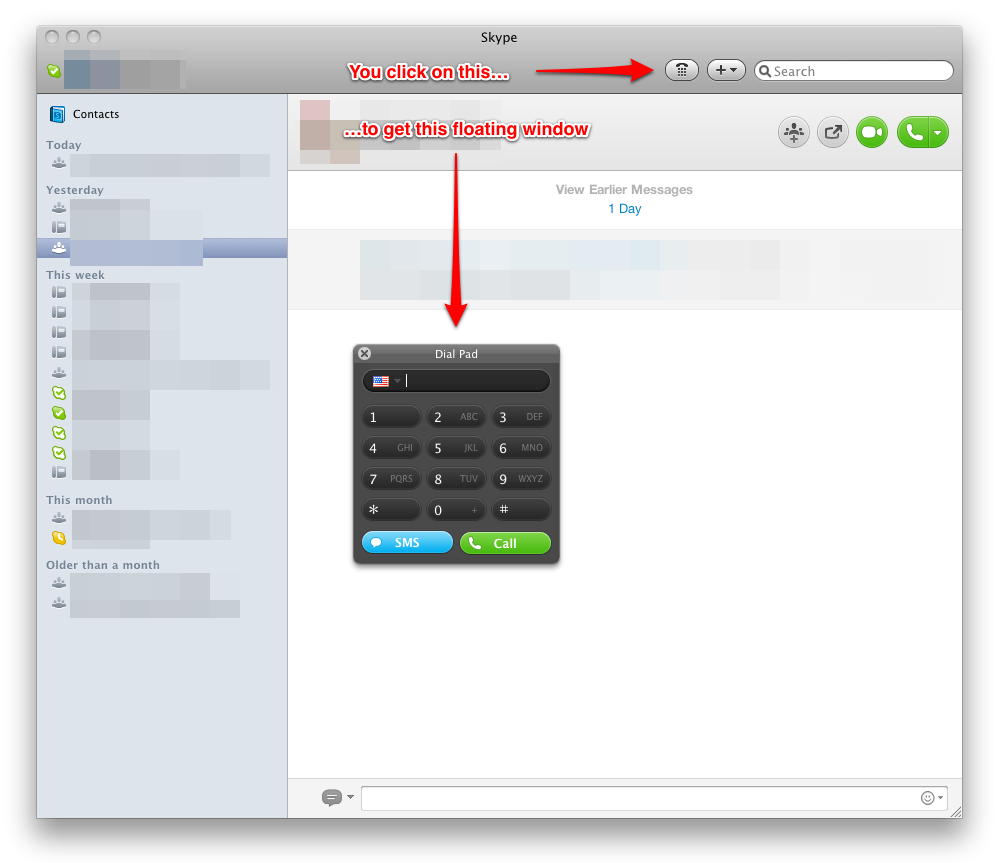
A very common use for Skype for me, and I suspect for many others who pay too, is to call into conference calls. It is much more fun to sit with your headset on and peruse browser windows while someone boring is talking, than it is to hold a device to your ear for an hour and get hand cramps. And on phone devices, muting and unmuting is a terrible ordeal, whereas with Skype it is a simple click of a software or hardware button and you don’t have to remove the device from the ear.
To dial to conference calls, you often have to enter a number, and then navigate through some menu by pushing buttons on your dial pad. In the old version, you started a call, got a new window, pushed a button to have a dial pad, and could then work with it.
In the new version, here’s what I don’t get: I have to push a button to get a dial pad to start dialling at all. I can’t just enter a number like I could before. And here’s the crazy part: once the call connects, the dial pad actually GOES AWAY. The first time this happened, I panicked. I just got connected to a conference system, where a robot woman asked me to type some numbers, and yet the dial pad was nowhere in sight. Gone. Disappeared. I actually disconnected the call and was very confused. How come I can’t enter the numbers as I call in? But no, turns out I needed to press the button again after the call was connected, to get back the dial pad.
Why can’t the pad be part of the single window? Why does it come and go like this? Who knows. But it does add to the sense of inconsistency of the design. (See also: LKM’s description of how jarring it is to send links during video calls now. These—sending links during video calls and pushing dial pad buttons during phone calls—are both examples of tasks that are harder to accomplish during calls in the new version.)
It used to be good
Perhaps the saddest part is that beyond any single feature or decision made, Skype on desktop has simply ceased to be a showcase item for well-designed desktop software. It has been a very long time since I’ve heard anyone refer to Skype in such a way. It used to be the poster child, and now it has become the same crapware that it used to challenge (MSN Messenger, Yahoo Messenger, AOL and the like.)
Does it matter? Tactically, probably not so much. It continues to make money and sign up people just fine. But for self-image and hiring and other such soft things?
Probably, but it’s not everything. Desktop these days is not that interesting any more. The big question is, what happens with post-PC devices like phones and tablets and other categories where Skype is active, like TV-s. Skype’s phone apps work reasonably well and are more focused and less crapware-like.