How my basic communication design class has messed up my perception in a good way
October 23, 2007
I’m taking a basic communication design class. The stuff that all graphic designers and any other designers took in kindergarten. (Or at least should have.) Where you talk about really basic things like gestalt principles, typefaces/typography and such.
One thing this class has done to me is to make me more aware of typography around me. So very often I now go around and look at letterforms instead of the words. For example…
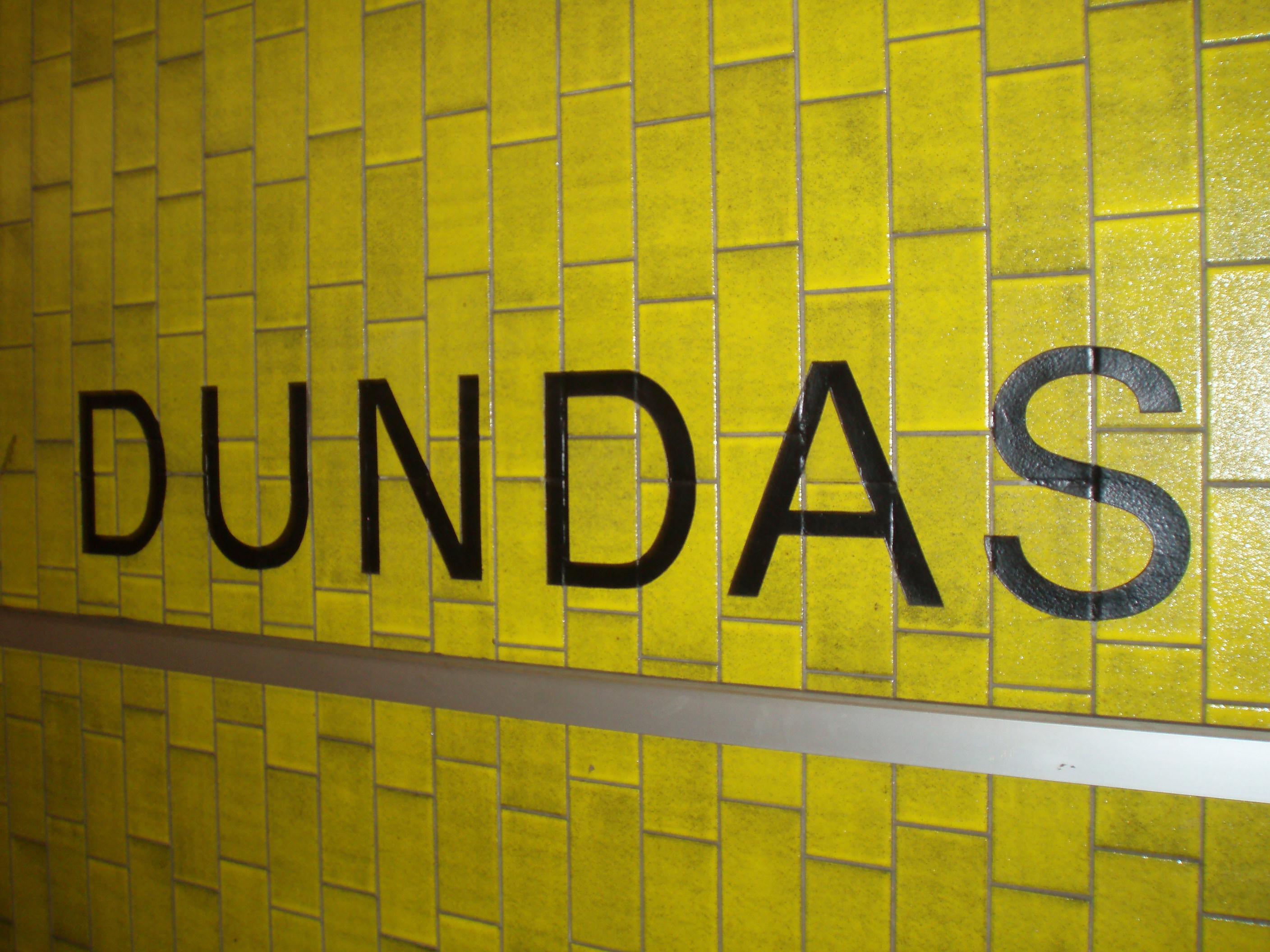
Does this read “Dundas” to you (a Toronto metro station)? To me, it reads “Helvetica, or some other similar neo-grotesque typeface.” And although perspective is a bit messed up because I didn’t want to get the flash reflection, note how the lower curves of U and S go a tiny bit below the baseline to give the letterforms a more solid appearance, instead of making it look like they float in air. Letters are extra spaced.”
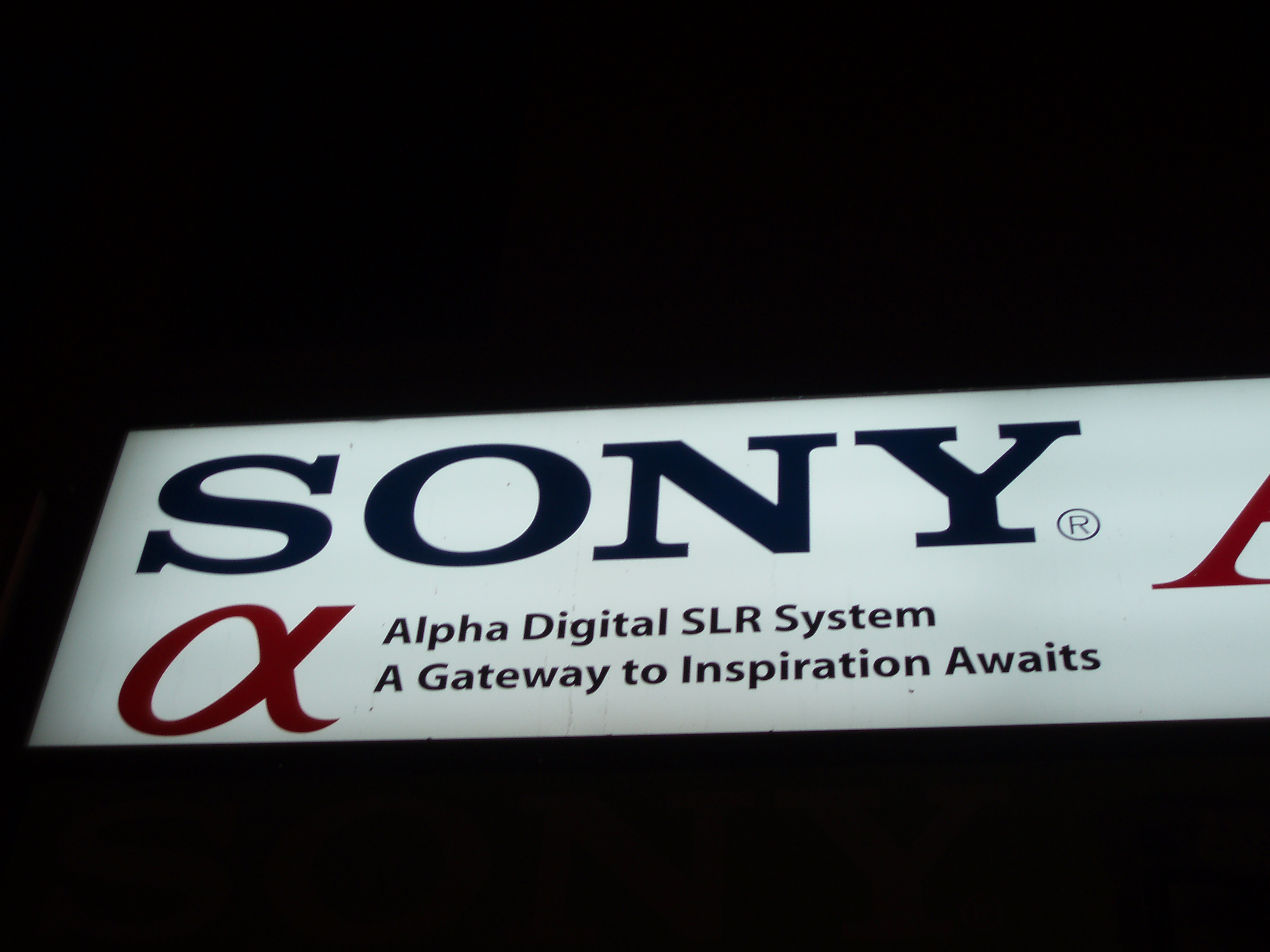
Is this “Sony”? Nope, it’s “Egyptian slab serif uppercase (I don’t think those typefaces even HAVE lowercase?)”. :)
I guess this is a good thing, since this class are actually supposed to teach us this – look around.