How does Android’s nine-patch tool work from a designer’s perspective?
July 21, 2011
If you’re building or designing stuff for Android, you’ll at some point consider something called a “nine-patch image”, or “9-patch”.
Nine-patch by itself is not a new concept, and it exists in many design tools and frameworks, either as a readymade component, or as a hacked workaround, say, in case of HTML. All the concept means is that there’s a 3x3 grid image where the four corners stay fixed, and the middle parts are stretched to fit the desired size container. Exactly the same in Android.
While the engine itself seems to work great, the workflow to actually create a nine-patch is very Google-y and developer-y and can make a poor designer’s head explode. Google has a help page which is somewhat obscure, and the provided examples are not super clear.
Digging around a bit takes you to random blog pages that contain key pieces of info that are not clear on the Google page, such as…
You then add black pixels along the edges to indicate the stretchable region (inferred from the marks on the top and left edges) and information about the NinePatch’s padding (inferred from the marks on the bottom and right edges).
But we’re getting ahead of ourselves. So, let’s go back to beginning and ask:
How to produce a 9-patch image for Android?
Creating the base image
This is easy enough if you’re a designer. Let’s say your layout comp contains something like this:
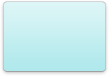
Nothing too fancy. Just a simple module skin with some shadow and gradient. Export it as a PNG.
Launching the tool
You’ll need to have Android developer tools. I’ll skip this part and assume there is some divine magic whereby the said tools somehow end up in your computermachine. Ask your fellow developer for help if you need. They will be super excited to set up the Android SDK tools for you.
So you open Terminal and launch the official nine-patch image tool…
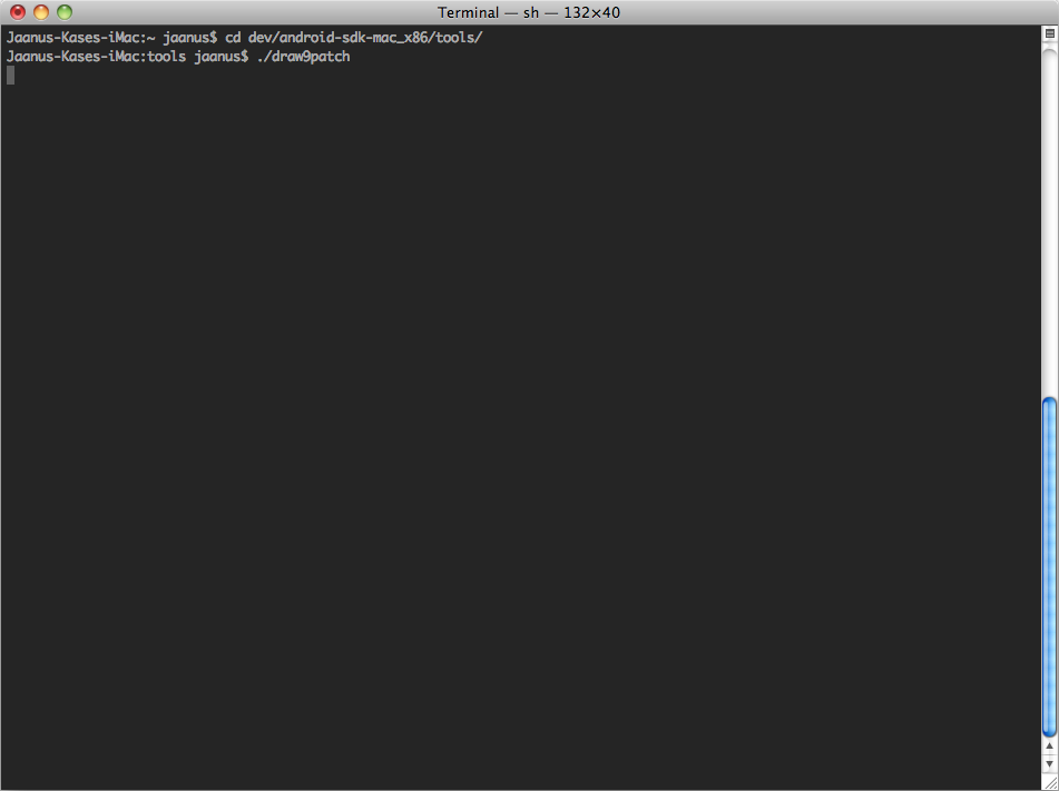
… and you see this.
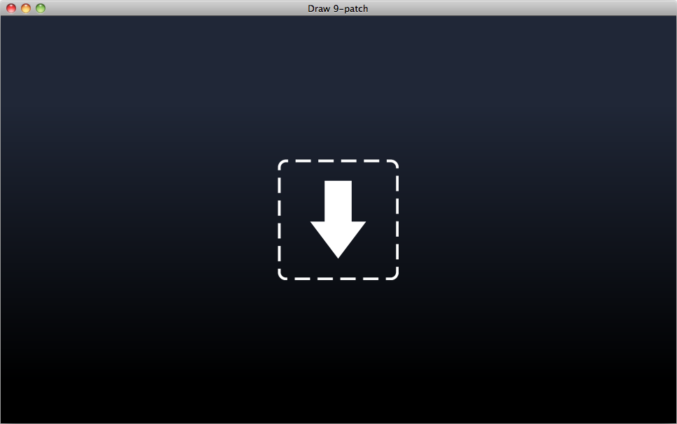
Opening the base image in the tool
Okay. This is not bad. Is this a standard drag’n’drop icon? In any case, you realize that there’s exactly one thing you can do here: drop your freshly created PNG onto this thing. And KABOOM!
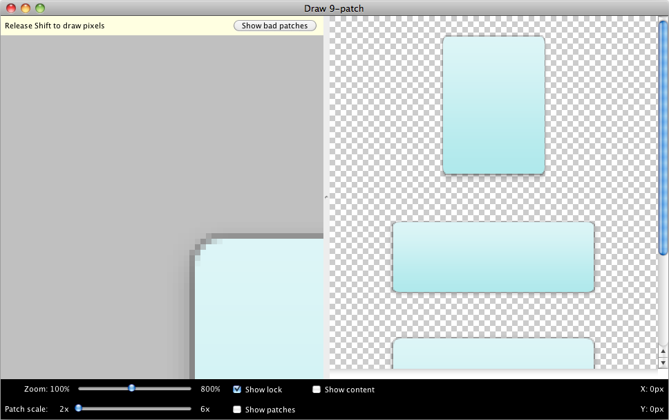
Wait. What? This is kinda sorta my PNG, but not really. Why is the left part showing only a corner? I think I can understand the right part, which is showing the image in stretched configurations. But how do I navigate?
I think the tool is a bit broken, at least in my Snow Leopard. This broken-ness is easily fixed if you just drag the “Zoom” slider around a little bit.
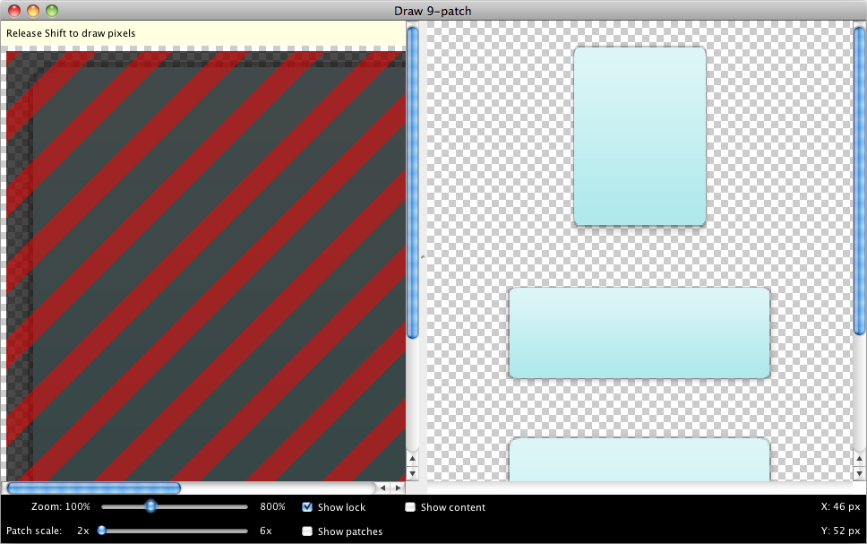
Okay. That’s better… I guess. At least there are scrollbars now. And there’s some fancy striped business going on.
Defining the stretchable areas
The striped business is telling you that in the left part, the only place you can interact with is the one-pixel frame that was added to your image. You can’t really touch the image itself.
Well, okay then. Let’s start drawing.
![]()
As you draw to the top part, you’ll notice the image in the right being a bit broken. Don’t worry, it will fix itself soon.
What you are doing now is defining the area that will be horizontally stretchable. Anything left and right of the one-pixel line will NOT be stretched. The horizontal column defined by the one-pixel line that you’re just drawing will be stretched as wide as the app needs.
Go ahead, draw the horizontal area as wide as you like, and draw something vertically as well to the LEFT column.
![]()
Aha! As soon as you start to draw vertically, you see that the preview on the right magically fixes itself. This is because the app now has all the info it needs to stretch your image, and you see it tiling nicely.
At this point, I was satisfied myself, and thought this is all there is to it. I saved the image, gave it to my developer… and their Android tool shaked their virtual fist to my face and said the image is broken. Why? We have defined the stretchable area by this point, but we have not defined another important part: the content area.
So let’s get right on to that.
Defining the content area
The stretchable area is defined by the one-pixel rails to the TOP and LEFT of the base image. The content area is defined by the rails to the RIGHT and BOTTOM of the image. So let’s define some content areas.
To continue, turn on the “Show patches” and “Show content” checkboxes and your image suddenly becomes a whole lot fancier.
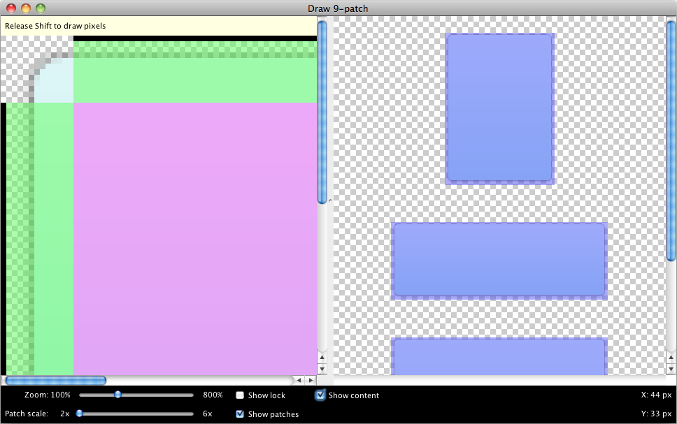
Well, the violet content area covering up the whole image is just wrong. Let’s draw something to the right and bottom of the image.
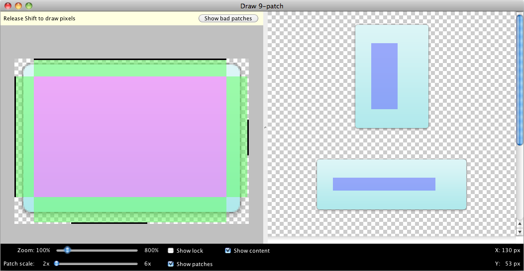
I’ve zoomed out here to show the entire left base image, a fairly large stretchable area, and a pretty small content area.
Understanding the nine-patch content area
If you are using a nine-patch as a background to some layout container, it’s critical that you understand what the content area means, and you work with your developer through the ramifications.
Let’s take a typical situation: you have a layout container like RelativeLayout. You used, say, a static image or a static color as a background. So your setup may have been something like this.
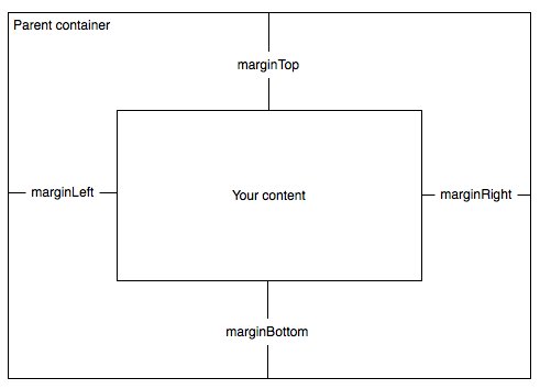
Now, when you replace the background of the container with a nine-patch, here’s what happens.
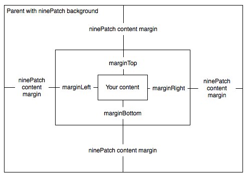
See how the content gets squished? This is because you have double margins now. You have the content margin that is visually specified in the nine-patch, and you have the previous margins defined in Android layout code which are now inside the nine-patch content area.
What do you do? You probably just want to remove the margins from the code and control the content margins entirely with the nine-patch from this point forward.
Fixing the content area
So let’s fix the content area. Here’s what a typical layout might be like.
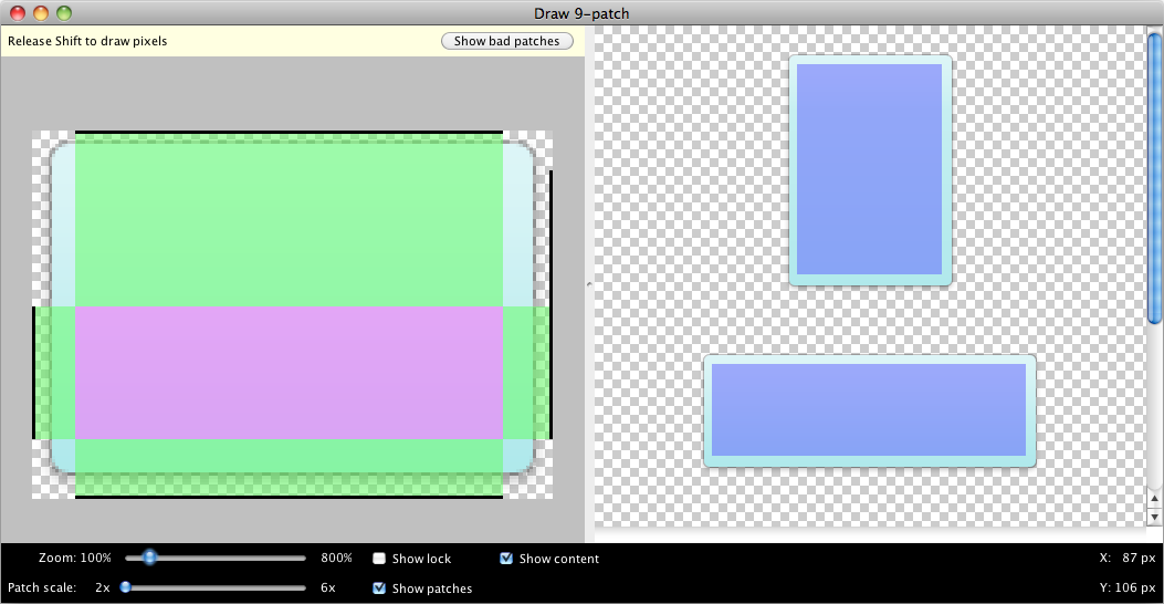
You see that the content area pretty much spans the entire size of the image minus some margin, but only the bottom part is stretchable. This might be because you’re doing some fancy gradient business in the top part that you want to keep there no matter what.
Understanding the minimum module size
How does the stretching work? If you’ve defined a stretchable area, does it also work in the other direction and get squished if the desired layout is narrower/shorter?
I thought so. But I was wrong. The stretchable area never gets compressed below the size in the image. So you really need to think about what’s the minimum size going to be, and how to accommodate the design for that.
In this example, since the horizontal stretchable part is all the same, you could literally cut it out from the image and just leave a one-pixel stretchable area. The vertical part is more tricky since it has a gradient. If you compress the gradient too much, you’ll get visible artifacts. But if you leave it tall, your module will have a tall minimum size.
Exporting the image and the bonus part
After you’re done, just select “Save 9-patch…” from the tool’s File menu, and you’ll see a name.9.png created. Perhaps like this one.
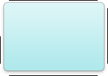
The bonus part? I don’t think you need to use the Google-provided Android tool at all. I haven’t investigated the PNG, but I don’t think it’s anything special beyond just having this 9.png filename. You could literally just add a one-pixel frame around your image in Photoshop and draw the black indicators on that frame.
The one advantage of the Google tool is that it immediately shows you the effects of your actions and whether the stretching and content area really works. But if you’re a designer and you just have Photoshop or Pixelmator or such, you can do all of the above with that tool, just save an image with the extension .9.png and hand it off to your developer.